Grafana Dashboards That Actually Tell You Something: How to Build Observability Views Engineers Use
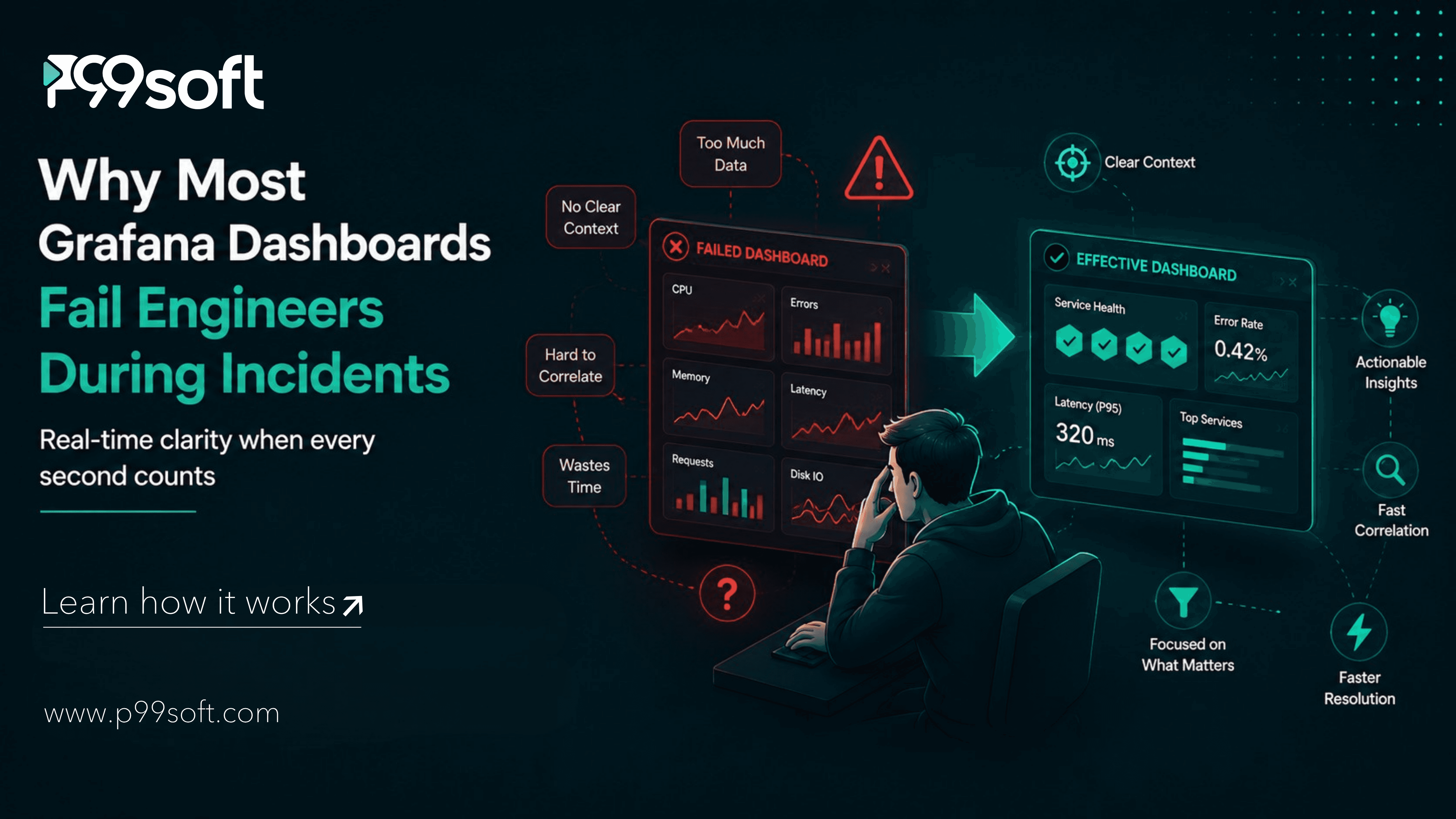
Grafana dashboards that engineers actually use follow three design principles: they show service health through the RED method (Rate, Errors, Duration) as the primary view, they use template variables so a single dashboard serves multiple services and environments without duplication, and they link directly to runbooks and related dashboards so an engineer can navigate from alert to context to action without leaving the interface. Dashboards that show everything tell you nothing.
Most engineering teams with Grafana installed have the same relationship with their dashboards. They exist. They were built at some point, usually during an incident or a post-mortem action item. They have accumulated panels over time as each new metric seemed worth watching. They load slowly. Nobody is entirely sure which dashboard to open first when something goes wrong. Several dashboards show the same metrics in slightly different ways. New engineers get a tour of the dashboards during onboarding and then quietly stop using most of them within a month.
The Grafana Labs 4th Annual Observability Survey, based on 1,363 responses from engineers, SREs, and technology leaders across 76 countries, found that complexity and overhead topped the list of observability concerns for 2026, cited by 38% of respondents, more than signal-to-noise challenges at 34% or cost at 31%. Alert fatigue remains the biggest single obstacle to faster incident response.
Complexity and alert fatigue are not tool problems. They are design problems. Grafana can surface exactly the information engineers need during an incident in a clean, navigable, fast-loading dashboard. The same tool can also produce an 80-panel wall of charts that tells you everything and communicates nothing. The difference is entirely in how the dashboard was designed.
More than three-quarters of all respondents, 77%, say they have saved time or money through centralized observability. The organizations in that 77% built their observability dashboards with a specific user and a specific moment in mind. The on-call engineer at 2am. The question they need answered in the first 90 seconds. The path from alert to action.
Why Most Grafana Dashboards Fail Engineers During Incidents
Grafana dashboards fail engineers not because the data is wrong but because the design is wrong. Four specific design failures produce the dashboard experience that makes engineers stop trusting what they see.
Too many panels, too much context required. A dashboard with 40 panels requires an engineer to know which 4 panels are relevant to the incident they are investigating. During an incident, that knowledge requirement is a cognitive load the engineer does not have spare capacity for. The dashboard shows everything and communicates the priority of nothing. Good dashboard design makes the most important signals impossible to miss.
No clear entry point from an alert. When Alertmanager fires an alert and the engineer opens Grafana, where do they go? If the alert link points to the dashboard root rather than a specific panel, or if no link is included at all, the engineer loses 60 to 90 seconds navigating before they can even begin the investigation. Every alert should link to the specific dashboard panel and time range that shows the alerting condition in context.
Static dashboards that do not respond to context. A dashboard designed for one specific service requires a new dashboard for every additional service. Teams with 20 services often have 20 near-identical dashboards that differ only in the service name hardcoded into each query. Template variables eliminate this by making a single dashboard serve any service, any environment, and any time range through selectable filters at the top of the dashboard.
Panels loaded from full raw queries that take 30 seconds to render. A dashboard that requires the engineer to wait 30 seconds for panels to load before they can read anything is a dashboard that trains engineers to start the investigation elsewhere and check the dashboard later. Recording rules in Prometheus pre-compute expensive aggregations so dashboard panels load from fast, simple queries rather than from expensive real-time calculations.
Dashboard design is a user experience problem, not a data problem. The data Grafana needs is almost always available. Whether that data is presented in a way that helps engineers make fast decisions during an incident is entirely a design choice.
The RED Method: The Framework Every Service Dashboard Needs
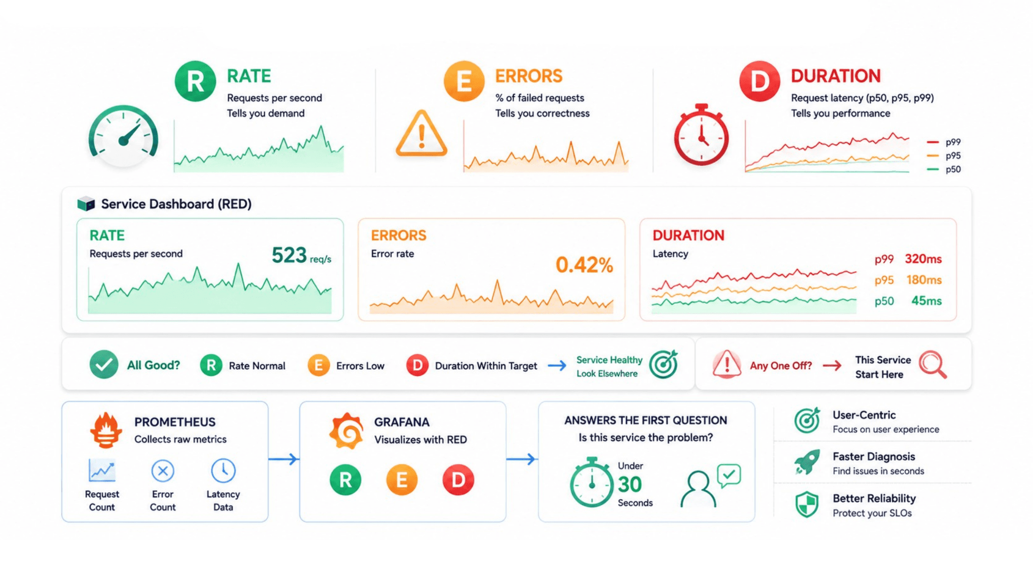
The RED method, developed by Tom Wilkie at Grafana Labs, defines the three metrics that tell you whether a service is healthy from the user's perspective: Rate, Errors, and Duration.
Rate is the number of requests the service is currently handling per second. Rate tells you demand. A rate that drops suddenly when it should be steady indicates that requests are not reaching the service, which is a different problem from a rate that is normal while error rates spike.
Errors is the percentage of requests that are returning failures. Errors tell you whether the service is actually working for users. A 0.1% error rate on a service with a 99.9% availability SLO means the service is within budget. A 5% error rate means the error budget is burning rapidly.
Duration is the distribution of request completion times, specifically the median and the 95th or 99th percentile latency. The 99th percentile is the experience of your slowest 1 in 100 users. If that number exceeds the latency target in your SLO, users are experiencing unacceptable performance even when the median looks fine.
These three panels, Rate, Errors, Duration, placed at the top of every service-level dashboard, give an engineer everything needed to answer the first question in any incident: is this service the problem? If Rate is normal, Errors are low, and Duration is within target, the service is healthy and the investigation should move elsewhere. If any of the three is outside normal range, this service is the starting point.
The RED method pairs naturally with the Prometheus Consulting work that establishes the underlying metrics. Prometheus collects the raw request count, error count, and latency data. Grafana presents it as the RED dashboard. The two tools together produce a service health view that answers the primary diagnostic question in under 30 seconds.
The USE Method: Infrastructure Dashboards That Show What Is Under Pressure
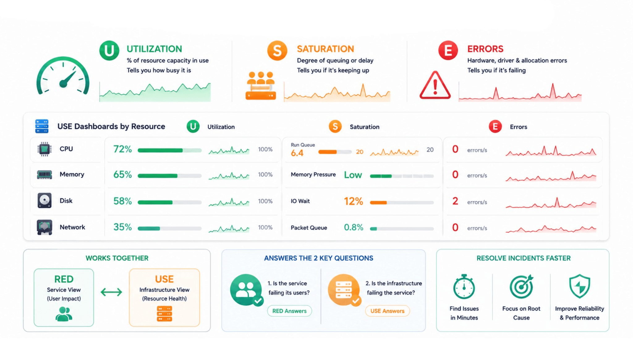
Where RED measures what services are doing for users, the USE method measures what infrastructure resources are doing for services. USE stands for Utilization, Saturation, and Errors, and it applies to every physical or virtual resource in the system: CPU, memory, disk, and network.
Utilization is the percentage of the resource's capacity currently in use. A node CPU at 90% utilization is a problem because 10% headroom disappears quickly under burst load. A node CPU at 20% utilization has capacity to absorb demand spikes.
Saturation is the degree to which additional requests to the resource are being queued or delayed rather than served immediately. A CPU at 60% utilization with a run queue depth of 8 is more saturated than a CPU at 80% utilization with a run queue depth of 0, even though the utilization number suggests otherwise. Saturation tells you whether the resource is keeping up or falling behind.
Errors at the infrastructure level are hardware errors, driver errors, and resource allocation failures. A disk reporting write errors is a reliability risk even when its utilization is low. A network interface dropping packets is a service reliability risk even when throughput appears normal.
A USE dashboard for each node type in the cluster, one for application nodes and one for control plane nodes in a Kubernetes environment, sits alongside the service-level RED dashboards and covers a different diagnostic question: is the infrastructure that services run on under pressure?
The combination of RED and USE dashboards answers the two questions that resolve most production incidents within the first five minutes: is the service failing its users, and is the infrastructure failing the service.
Template Variables: One Dashboard for Every Service and Environment
Template variables are the Grafana feature that separates a maintainable dashboard architecture from a sprawling collection of near-identical dashboards. A template variable creates a selectable filter at the top of the dashboard, and every query in the dashboard uses that variable rather than a hardcoded value.
A service variable populated from the list of services currently reporting metrics to Prometheus means the same dashboard can show RED metrics for the payment service, the inventory service, or the authentication service by changing a single dropdown selection. An environment variable populated from the available deployment environments means the same dashboard works for development, staging, and production. A namespace variable means the same Kubernetes infrastructure dashboard covers every namespace in the cluster.
The operational benefit is that when the dashboard design improves, every service benefits immediately. Fixing a panel layout, adding a new metric, or improving the color scheme on a dashboard with template variables updates the view for every service that uses it. A collection of 20 hardcoded service dashboards requires 20 separate updates for the same improvement.
Variable-linked dashboards also support the drill-down navigation pattern that makes incident investigation efficient. A top-level cluster health dashboard links to service-level dashboards, passing the relevant service name as a variable. The service dashboard links to the node infrastructure dashboard, passing the relevant node name. An engineer following this navigation path moves from the broad health picture to the specific failing resource in three clicks without reformulating any queries manually.
Dashboard Hierarchy: Three Levels Every Enterprise Observability Stack Needs
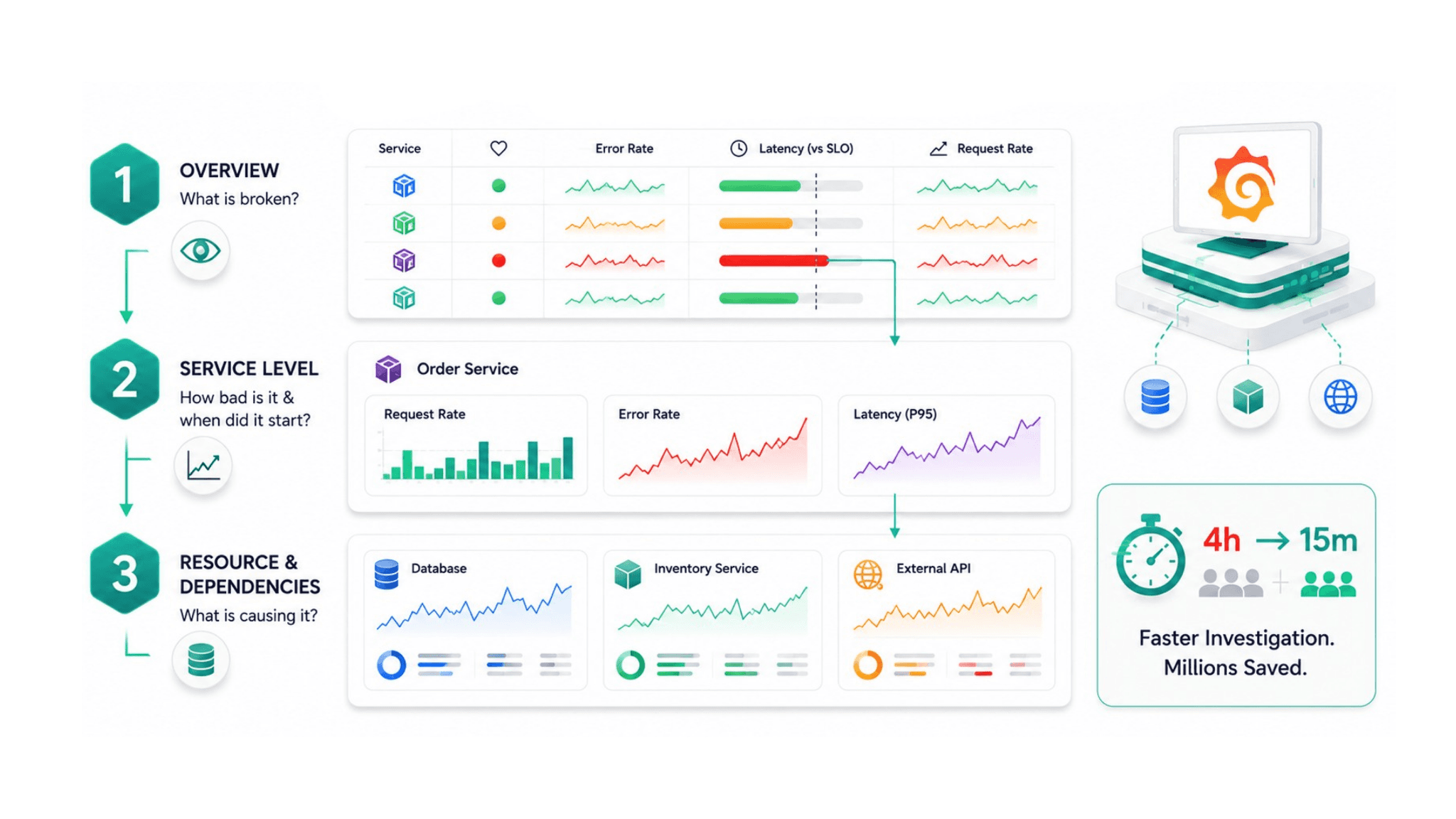
A dashboard hierarchy organizes Grafana dashboards into three levels that match the three different stages of an incident investigation.
Level 1: The overview dashboard. This is the first dashboard any on-call engineer opens. It shows the health status of every service in the system at a glance, using color coding that makes degraded services immediately visible. Each service row shows its current error rate, its latency against the SLO target, and its request rate. A service that is healthy shows green. A service that is approaching its SLO limit shows amber. A service that has breached its SLO shows red. The overview dashboard answers the question "what is currently broken" in under 10 seconds.
Level 2: Service-level dashboards. When the overview dashboard identifies the degraded service, the engineer clicks through to that service's dashboard. This is the RED dashboard described above, showing request rate, error rate, and latency distribution for the specific service over the relevant time range. This level answers "how bad is it and when did it start."
Level 3: Resource and dependency dashboards. When the service dashboard identifies a pattern, the engineer drills further into the resource or dependency causing it. A latency spike in the order service points to either the database it queries or the inventory service it calls. A resource dashboard for the database, showing query latency, connection pool utilization, and slow query counts, or the inventory service's RED dashboard, answers "what specifically is causing the behavior."
This three-level hierarchy means every incident follows a consistent investigation path that any engineer on the on-call rotation can execute without needing to know the idiosyncratic organization of a collection of unstructured dashboards.
One engineering team reported saving the equivalent of nearly $1.8 million from a four-hour outage they believe would have resolved in 15 minutes with properly structured observability. The time difference was entirely in the investigation phase, finding the cause, not the remediation phase. A dashboard hierarchy that enables 15-minute investigations rather than 4-hour ones produces that kind of operational value.
Grafana Alerting: Connecting Dashboards to Action
Grafana's native alerting connects the dashboards directly to the notification infrastructure, so the same thresholds that define when a panel turns red are the thresholds that trigger PagerDuty, Slack, or email notifications.
The critical design connection between dashboards and alerts is that every alert notification should link back to the exact dashboard panel showing the alerting condition. An alert that fires and sends a notification with a link to the dashboard root requires the on-call engineer to navigate to the relevant panel manually. An alert that links directly to the panel showing the alerting condition in a time range centered on when the alert fired gives the engineer immediate visual context without any navigation.
Alert annotations in Grafana place a vertical marker on the time series graph at the moment the alert fired. When the engineer opens the dashboard from the alert link, they see the graph with a visual indicator of exactly when the condition was first detected. This removes the "when did this start" investigation step from the workflow entirely.
The connection between Grafana alerting and Alertmanager, the component in the Prometheus stack that handles alert routing and deduplication, means the same alert can route differently based on severity. A critical alert routes to PagerDuty for immediate human response. A warning alert routes to a Slack channel for business-hours review. The routing configuration lives in Alertmanager while the threshold and dashboard integration lives in Grafana.
P99Soft's Grafana Solutions practice designs this complete alerting chain as part of every observability implementation, from the Prometheus recording rules and alerting rules through the Grafana dashboard hierarchy, alert annotations, and Alertmanager routing configuration. The goal is an alerting experience where every notification contains enough context for the on-call engineer to begin the investigation immediately rather than spending the first five minutes locating the relevant information.
Connecting Grafana to the Full Observability Stack
Grafana is most valuable when it serves as the single interface for the full three-pillar observability stack rather than as a metrics visualization tool alone.
Loki integration brings log data into the same interface as metrics. When a RED dashboard shows an error rate spike, the engineer can navigate directly from the affected service's metric panels to the log view for that service's pods filtered to the time range of the spike, without opening a separate logging tool. The log entries that correspond to the error rate increase are visible in context alongside the metrics that surfaced the problem.
Grafana Tempo integration brings distributed tracing into the same interface. When logs reveal a specific request that failed, the trace ID in the log entry can navigate directly to the trace visualization showing every service call that request made and exactly where it failed. The investigation path from metric to log to trace to root cause is a single-screen journey.
The Distributed Tracing Explained article covers how this trace-to-root-cause navigation works in practice, including how to read a trace waterfall to identify which service in a chain is responsible for a latency problem.
The Observability Implementation practice connects all three data sources to Grafana as a unified interface. The Prometheus Consulting practice establishes the metrics layer that feeds the RED and USE dashboards. Together they produce the observability environment where engineers open one tool, get the full picture, and resolve incidents faster.
Security observability connects through the DevSecOps Consulting work described in our DevSecOps Pipeline article. Authentication failure rates, certificate expiry timelines, pipeline security scan result trends, and vulnerability discovery rates over time all belong in the same Grafana environment as reliability metrics. An engineering team that can see both application reliability and security posture in the same interface makes faster decisions about whether a reliability anomaly is operational or security-related.
Practical Dashboard Design Decisions That Separate Good From Great
Beyond the structural framework, several specific design decisions determine whether a Grafana dashboard is genuinely useful or merely populated.
Use consistent color semantics across all dashboards. Green means healthy. Amber means approaching a threshold. Red means breached or failing. When these color semantics are consistent across every dashboard in the organization, engineers can read health status without reading individual values. The overview dashboard communicates the cluster health state visually in the time it takes to see which rows are not green.
Set meaningful y-axis ranges rather than auto-scaling. An auto-scaled y-axis that expands to show a 0.001% fluctuation as a dramatic spike trains engineers to distrust the visual signal. Fixing the y-axis range for error rate panels at 0 to 100%, with the SLO threshold line drawn at the appropriate percentage, shows every data point in the context of the actual operational target.
Add threshold lines that reflect SLO boundaries. A latency panel that shows a horizontal line at the 99th percentile SLO threshold of 500 milliseconds makes it immediately clear when observed latency is approaching or breaching the commitment. Without the threshold line, the on-call engineer must remember the SLO value and compare it to the y-axis manually.
Limit each dashboard to one primary question. The best Grafana dashboards are designed to answer one specific question well rather than many questions approximately. A service health dashboard answers "is this service meeting its SLO right now?" A capacity planning dashboard answers "when will this node run out of resources at current growth rate?" A deployment dashboard answers "did this deployment change any reliability metrics?" One question per dashboard produces a dashboard architecture where engineers know exactly which dashboard to open for each investigation.
In 2025, 84% of organizations reported exploring or piloting AI in observability, with movement from prototypes to practice accelerating in 2026. Rather than replacing human judgment, AI in observability amplifies it by automating routine investigation steps and surfacing insights faster. The best observability infrastructure is one where the dashboard design makes routine investigations routine enough that engineers have cognitive capacity for the genuinely complex problems.
FAQ
What are Grafana dashboard best practices for engineering teams?
The most important Grafana dashboard best practices are: design around the RED method (Rate, Errors, Duration) for service-level dashboards and the USE method (Utilization, Saturation, Errors) for infrastructure dashboards; use template variables so a single dashboard serves all services and environments without duplication; build a three-level hierarchy from overview to service to resource so incident investigation follows a consistent path; connect every alert notification directly to the relevant dashboard panel so engineers have immediate context; and limit each dashboard to answering one primary question clearly rather than showing all available metrics.
What is the RED method in Grafana observability dashboards?
The RED method is a service health framework developed at Grafana Labs that defines the three most important metrics for any user-facing service: Rate, the number of requests per second the service is currently handling; Errors, the percentage of requests returning failures; and Duration, the distribution of request completion times including the 99th percentile latency. These three panels placed at the top of every service dashboard give on-call engineers the information to determine whether a specific service is the source of an incident in under 30 seconds, without needing to understand the full metric inventory of the service.
How do template variables improve Grafana dashboards?
Template variables create selectable filters at the top of a Grafana dashboard that replace hardcoded values in all panel queries. A service variable means the same dashboard layout can display RED metrics for any service by changing a single dropdown. An environment variable means the same dashboard covers development, staging, and production. Template variables prevent the maintenance problem where improving a service dashboard requires the same change to be made in 20 separate dashboards. They also enable drill-down navigation between dashboards, passing context like service name and time range as variables so engineers move from overview to detail without reformulating queries.
How should Grafana dashboards be organized for enterprise engineering teams?
Enterprise Grafana environments benefit from a three-level dashboard hierarchy. The first level is an overview dashboard showing the current health status of all services in the system at a glance, using color coding to make degraded services immediately visible. The second level is service-level RED dashboards that show request rate, error rate, and latency for a specific service using template variables. The third level is resource and dependency dashboards that show infrastructure utilization, database performance, and downstream service health for the specific layer causing the observed service degradation. This hierarchy gives every on-call engineer a consistent investigation path regardless of which service is affected.
Author Name - Mrunalini Wankhede